Maximising attention for publishers: Website layout strategies
It is well established that attention is the metric of the moment, with publishers and advertisers actively using it to document what good looks like in a digital advertising context. The IAB has concluded that attention serves as a 6x better proxy for predicting ad recall and is 7x more effective in predicting awareness compared to viewability.
To date, the majority of the conversations on attention have been focused on the buy side of media and how the concept can be used to optimise and measure the success of a campaign. However, little has been said and done to facilitate how publishers apply attention to create competitive advantage.
After analysing the eAPM (Effective Attention per Mille) data from the AAS (Adnami Attention Score), we’ve developed insights specifically geared towards publishers. In this “Attention for Publishers” blog series we will be examining these findings and discussing how publishers can use them to incorporate and optimise their websites for attention. This first blog will start by looking at attention in the context of layout and in particular the layout of news sites.
Site layout impacts attention
The page layout of a website is incredibly important for a number of reasons and plays a significant role in how readers engage with a site.
Analysing the data from the AAS (Adnami Attention Score), we have discovered some underlying characteristics top-performing news websites share when it comes to attention. These sites generate, on average, three times more attention than most news sites and share the following traits.
1. Descriptive headlines and subtext impact attention and time spentWe’ve seen that headlines using descriptive language as well as many characters to let the reader understand what to expect from the main content of the article perform better on attention. While this sounds obvious, it is an important point, as news category publishers occasionally fall for the temptation to use short and seductive headlines to drive up page views and consequently ad avails. While this tactic drives up page views, it does prove to decrease dwell time and therefore attention performance.
On the other hand, when publishers use descriptive headlines with many characters, they harness increased attention performance on the main page, where the average user will spend more time navigating content and scanning the selection of content to consume. They also harness increased attention performance on the actual article pages, as the users will have a better understanding of the content they are presented with.
We see a clear correlation between the amount of time a user spends on a publisher's website and page views and the attention an average user allocates to the ad placed on the respective site. To sum it up, optimising for attention is also optimising for a better user experience.
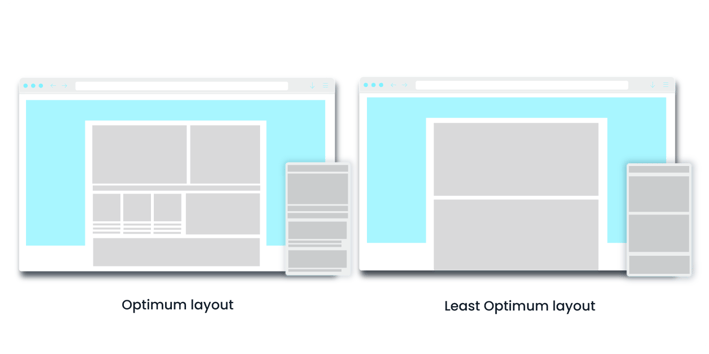
From our data we’ve observed that news sites with multiple articles in view on the front page generate up to a 5x better eAPM than those with only one or two. Keeping at least three articles in view of the reader engages the user and keeps them in one spot longer. Which in turn reduces the need for the reader to scroll quickly through the page for more content, thus increasing the attention for the ads placed in that environment.
Furthermore, if these articles are accompanied by multiple images, as well as descriptive headlines and subheaders, we see that those sites perform better than those containing only one large image and a short headline. Using images actively on the frontpage tells the story. It helps users navigate and provides them a resting place for the gaze that will positively impact attention.
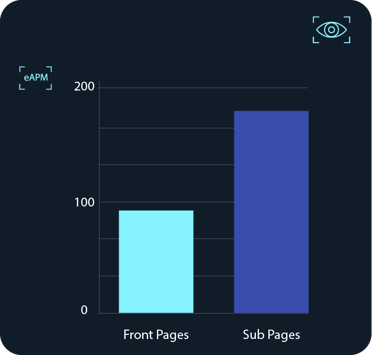
We’ve looked at page layout, but now let’s drill down further into site structure and, in particular, compare the opportunity for generating attention when it comes to front pages and subpages. Our eAPM data shows that news site subpages are better at creating attention than front pages. In fact, further analysis found that articles on subpages attract, on average, double the attention of their front-page counterparts.
The front page draws people in with a variety of available content whereas the subpage is where people spend time reading selected articles. Taking into account the different functionalities between front and subpages, publishers (and advertisers) can optimise for attention based on these differences. For example, publishers could consider bundling their inventory into separate packages to optimise for attention and yield.

4. Standard ads deliver best performance on mobile devices but still fall short compared to high impact
While this last point is not specific to news sites, but more a general observation, it is still worth highlighting. Our findings show that 300x250 banners specifically generate more than 2.5x attention on mobile versus desktop. This is because a standard banner on a mobile screen takes up a higher share of screen coverage than the same banner on a bigger desktop screen. In addition, typically a standard banner on mobile is also in line with the content, which is often not the case on a desktop. For those reasons, mobile banners deliver a relatively strong performance on attention compared to desktop.
Though a 300x250 banner performs better on mobile versus desktop it still falls short when compared to high impact formats. For instance, we’ve seen that our Mobile Midscroll format generated 2.2x more attention than a 300x250 mobile banner. Based on these outputs there is an opportunity for publishers to optimise their pricing strategies and or adjust inventory to include more of both these attention grabbing formats.
In summary we have found that publishers have a lot of control over the attention outcomes produced by the ad impressions they generate. The website layout is a direct driver of how strongly (or poorly) a website performs when it comes to attention outcomes.
Based on the above, we can conclude that attention is a valuable and actionable metric for publishers. Understanding and optimising for attention not only translates into an enhanced user experience but also leads to better advertising outcomes. We hope this has helped to introduce a few ideas about attention and the potential it holds for premium publishers of all shapes and sizes.
We will continue to explore how publishers and brands can understand and optimise towards attention and thereby better advertising outcomes. In the following blogpost we will take a closer look at what impacts ad performance and what that means for publishers. We’ll also dive into other potential areas of opportunity to optimise for attention. Stay tuned for the next blog!


