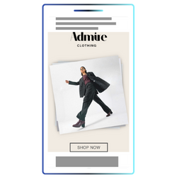
A responsive banner template for mobile formats that allows for the easy creation of an interactive photo stack creative. The template features an interactive carousel of up to 6 "photos", that can be swiped on to navigate through. A "swiping hand" animation is automatically added to the banner, to encourage users to interact.
Example
Format Specs
Background Image:
Optional - JPG or WEBP, 250kb Max.
Use a 9:16 aspect ratio (eg 1080x1920px). Background will be stretched to cover the entire banner, and will appear behind the logo, CTA and interactive photos, so avoid adding elements that cannot be cropped or obscured on the background.
Photo stack images:
Up to 6 photos, JPG or WEBP, 250kb Max each.
Size is flexible, for best results use a square aspect ratio (eg 640x640px), to avoid content from being cropped.
Logo:
Up to 640x150 (flexible) - SVG, PNG or WEBP with transparent background, 250kb Max.
For best results, export without any empty space, and use the settings within the template to set the logo width and height using responsive units.
CTA:
Up to 640x150 (flexible) - SVG, PNG or WEBP with transparent background, 250kb Max.
For best results, export without any empty space, and use the settings within the template to set the CTA width and height using responsive units.
Format description and guidance
This template only supports a single click URL, which is triggered when a user clicks or taps anywhere on the banner.
Either upload a background image or set a background colour with a hex colour code.
Add a logo image and a CTA image. The logo always appears at the top of the banner, and the CTA appears at the bottom. You can customise the width and height of the logo and CTA to scale them as required - the template will automatically scale the photo stack so that everything fits within the available space.
The Vertical and Horizontal offsets allow you to control the amount of space (padding) between your overlays and the top/bottom or left/right edges of the banner.
Finally add your images for the photo stack - the number you can add is flexible. For best results we recommend using at least 3, up to a maximum of 6.
Max total file weight:
3.5 MB
Audio
None
Template Details
Mobile Photostack
General
| Parameter | Purpose |
|---|---|
| Click URL | Destination URL triggered when the user interacts with this element. Include https:// and any tracking parameters. |
Background
| Parameter | Purpose | Default |
|---|---|---|
| Background Colour | Hex colour (#RRGGBB or #RRGGBBAA) applied to this element. Use it to match brand palettes and overlay blends. | #ffffff |
| Background Image (optional) | Upload the background image (optional) asset (JPG, PNG, or WEBP). Follow safe-zone guidance and stay within the platform file-size limits. |
Logo & CTA
| Parameter | Purpose | Default |
|---|---|---|
| Logo Image | Upload the logo image asset (JPG, PNG, or WEBP). Follow safe-zone guidance and stay within the platform file-size limits. | |
| Logo Width | Width of the overlay, use a responsive unit such as 'vw', 'vh', or '%' to ensure it scales with the banner. To derrive the width from the height, use 'auto'. | 80% |
| Logo Height | Height of the overlay, use a responsive unit such as 'vw', 'vh', or '%' to ensure it scales with the banner. To derrive the height from the width, use 'auto'. | 10% |
| CTA Image | Upload the cta image asset (JPG, PNG, or WEBP). Follow safe-zone guidance and stay within the platform file-size limits. | |
| CTA Width | Width of the overlay, use a responsive unit such as 'vw', 'vh', or '%' to ensure it scales with the banner. To derrive the width from the height, use 'auto'. | 80% |
| CTA Height | Height of the overlay, use a responsive unit such as 'vw', 'vh', or '%' to ensure it scales with the banner. To derrive the height from the width, use 'auto'. | 8% |
Photos
| Parameter | Purpose |
|---|---|
| Image 1 | Upload the image 1 asset (JPG, PNG, or WEBP). Follow safe-zone guidance and stay within the platform file-size limits. |
| Image 2 | Upload the image 2 asset (JPG, PNG, or WEBP). Follow safe-zone guidance and stay within the platform file-size limits. |
| Image 3 | Upload the image 3 asset (JPG, PNG, or WEBP). Follow safe-zone guidance and stay within the platform file-size limits. |
| Image 4 | Upload the image 4 asset (JPG, PNG, or WEBP). Follow safe-zone guidance and stay within the platform file-size limits. |
| Image 5 | Upload the image 5 asset (JPG, PNG, or WEBP). Follow safe-zone guidance and stay within the platform file-size limits. |
| Image 6 | Upload the image 6 asset (JPG, PNG, or WEBP). Follow safe-zone guidance and stay within the platform file-size limits. |