
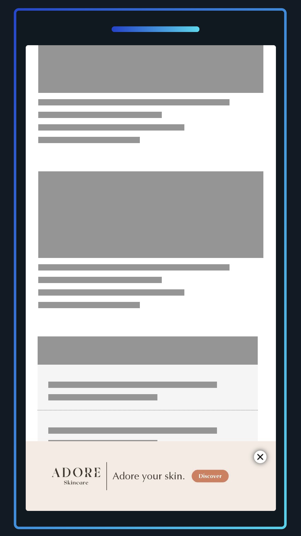
The simplest anchor banner: a single wide image pinned to the edge of the screen. It is used for the pre and post anchors in Mobile Midscroll Anchor and for the anchor in Mobile Skin.
Examples
Recommended default creative dimensions
Width: 1400px
Height: 320px
Ad Viewport
Width: 100% of the screen width
Height: Mobile Midscroll Anchor 15% of the screen height by default; Mobile Skin set by the Anchor Banner Height setting (100px by default).
Safe Zones
The image is centred and scaled to cover the anchor, so the sides are cropped on narrower or taller screens. Keep all essential content (logo, message, CTA) within the central 60% of the width (a central 860px wide area of a 1400px image). The top right corner is covered by the close button, so keep it free of essential content.
Asset types
Image (jpg, png or webp).
Format description and guidance
Treat the anchor as a single line of messaging: logo, a short headline and a CTA, read left to right. A strip this shallow cannot hold a product shot and a headline stacked on top of each other, so keep any imagery to one side of the copy and leave plain background behind the close button.
In Mobile Midscroll Anchor, choose the Image Anchor template. In Mobile Skin, choose the Image template, which also supports optional responsive logo and CTA overlays.
Max total file weight
Each anchor image should be kept below 250 KB. The anchors count towards the total weight of the format they are used in.
Click URL
Add the landing page as the Click URL. The whole anchor is clickable apart from the close button.
Template Details
Image Anchor
General
| Parameter | Purpose |
|---|---|
| Click URL | Global click destination for the anchor image banner. |
| Image | Recommended size 1400px x 320px. Centred; content outside the central 60% safe zone may be cropped. |
Image
General
| Parameter | Purpose | Notes |
|---|---|---|
| Click Url | Destination URL triggered when the user interacts with this element. Include https:// and any tracking parameters. | |
| Image | Upload the image asset (JPG, PNG, or WEBP). Follow safe-zone guidance and stay within the platform file-size limits. | Required |
Image Settings
| Parameter | Purpose | Default |
|---|---|---|
| Scaling Mode | Sets the scaling behaviour of the image, determining whether it will appear cropped or not. | cover | choices: cover, contain, fit to width, fit to height, original size |
| Image Anchor Point | Controls how the image anchor point aligns inside the frame. Pick the focal point that keeps the subject in view. | mid-center | choices: top-left, top-center, top-right, mid-left, mid-center, mid-right, bot-left, bot-center, bot-right |
| Background Colour | Dependant on the scaling mode, this colour will be visible in the behind the if there is any empty space. | #00000000 |
Overlay 1
| Parameter | Purpose | Default |
|---|---|---|
| Asset | Upload the overlay asset (JPG, PNG, or WEBP). Overlays render with object-fit: contain, so they will not crop and do not require extra safe-zone padding. | |
| Width | Width of the overlay, use a responsive unit such as 'vw', 'vh', or '%' to ensure it scales with the banner. To derrive the width from the height, use 'auto'. | auto |
| Height | Height of the overlay, use a responsive unit such as 'vw', 'vh', or '%' to ensure it scales with the banner. To derrive the height from the width, use 'auto'. | 10% |
| Position | Position of the overlay, relative to the banner. For left & right positions, the horizontal offset can be modify to set the distance from the respective edge. Likewise for top & bottom positions, the vertical offset will be used. | top-center | choices: top-left, top-center, top-right, mid-left, mid-center, mid-right, bot-left, bot-center, bot-right |
Overlay 2
| Parameter | Purpose | Default |
|---|---|---|
| Asset | Upload the overlay asset (JPG, PNG, or WEBP). Overlays render with object-fit: contain, so they will not crop and do not require extra safe-zone padding. | |
| Width | Width of the overlay, use a responsive unit such as 'vw', 'vh', or '%' to ensure it scales with the banner. To derrive the width from the height, use 'auto'. | auto |
| Height | Height of the overlay, use a responsive unit such as 'vw', 'vh', or '%' to ensure it scales with the banner. To derrive the height from the width, use 'auto'. | 10vh |
| Position | Position of the overlay, relative to the banner. For left & right positions, the horizontal offset can be modify to set the distance from the respective edge. Likewise for top & bottom positions, the vertical offset will be used. | bot-center | choices: top-left, top-center, top-right, mid-left, mid-center, mid-right, bot-left, bot-center, bot-right |
Text Overlay
| Parameter | Purpose | Default |
|---|---|---|
| Text | Copy displayed in the creative for this field. Keep it concise for readability on smaller screens. | |
| Font Size | Define the font size using responsive CSS units (px, %, vw, vh) so it scales across screens. | 1vw |
| Position | Position of the overlay, relative to the banner. For left & right positions, the horizontal offset can be modify to set the distance from the respective edge. Likewise for top & bottom positions, the vertical offset will be used. | bot-center | choices: top-left, top-center, top-right, mid-left, mid-center, mid-right, bot-left, bot-center, bot-right |
| Text Colour | Hex colour (#RRGGBB or #RRGGBBAA) applied to this element. Use it to match brand palettes and overlay blends. | #ffffff |
| Font | Select the font option from the list to control how the template behaves. | sans-serif | choices: sans-serif, serif, monospace, impact |
Overlay Config
| Parameter | Purpose | Default |
|---|---|---|
| Vertical Offset | For top & bottom positioned overlays, the vertical offset will be used how far away from the top/bottom edges of the banner the asset will appear. | 12vh |
| Horizontal Offset | For left & right positioned overlays, the horizontal offset will be used how far away from the left/right edges of the banner the asset will appear. | 5vh |