
Examples
Creative dimension
2560 x 1440px
Ad Viewport
Width: 100% of browser width
Height: 80% or 100% of browser height
Safe Zones
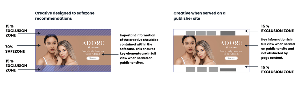
In order to ensure your important content (text, logos, CTAs etc) is visible on all screens and devices, please follow the guidelines on the validation tool below:
Note: Some publisher sites have a nav bar that covers the top of the creative - please check the publisher guidelines and make additional allowances with your safe zones if required.
Format description and guidance
Midscroll is a high impact responsive format that appears mid-way down a publisher page and is revealed as the user scrolls.
It is typically served to appear at 80% of the available browser window height, but can be up to 100%. To confirm the correct height please reach out to your contact within the respective publisher.
Max total file weight
100 KB - 200 KB
Asset types
JPG, PNG or WEBP
Click tags and tracking
For Adnami hosted creative, see our clicktags and tracking guide.
For creatives hosted using 3rd party tags, use the appropriate click methods and trackers for that provider examples.
Template Details
Image
General
| Parameter | Purpose | Notes |
|---|---|---|
| Click Url | Destination URL triggered when the user interacts with this element. Include https:// and any tracking parameters. | |
| Image | Upload the image asset (JPG, PNG, or WEBP). Follow safe-zone guidance and stay within the platform file-size limits. | Required |
Image Settings
| Parameter | Purpose | Default |
|---|---|---|
| Scaling Mode | Sets the scaling behaviour of the image, determining whether it will appear cropped or not. | cover | choices: cover, contain, fit to width, fit to height, original size |
| Image Anchor Point | Controls how the image anchor point aligns inside the frame. Pick the focal point that keeps the subject in view. | mid-center | choices: top-left, top-center, top-right, mid-left, mid-center, mid-right, bot-left, bot-center, bot-right |
| Background Colour | Dependant on the scaling mode, this colour will be visible in the behind the if there is any empty space. | #00000000 |
Overlay 1
| Parameter | Purpose | Default |
|---|---|---|
| Asset | Upload the overlay asset (JPG, PNG, or WEBP). Overlays render with object-fit: contain, so they will not crop and do not require extra safe-zone padding. | |
| Width | Width of the overlay, use a responsive unit such as 'vw', 'vh', or '%' to ensure it scales with the banner. To derrive the width from the height, use 'auto'. | auto |
| Height | Height of the overlay, use a responsive unit such as 'vw', 'vh', or '%' to ensure it scales with the banner. To derrive the height from the width, use 'auto'. | 10% |
| Position | Position of the overlay, relative to the banner. For left & right positions, the horizontal offset can be modify to set the distance from the respective edge. Likewise for top & bottom positions, the vertical offset will be used. | top-center | choices: top-left, top-center, top-right, mid-left, mid-center, mid-right, bot-left, bot-center, bot-right |
Overlay 2
| Parameter | Purpose | Default |
|---|---|---|
| Asset | Upload the overlay asset (JPG, PNG, or WEBP). Overlays render with object-fit: contain, so they will not crop and do not require extra safe-zone padding. | |
| Width | Width of the overlay, use a responsive unit such as 'vw', 'vh', or '%' to ensure it scales with the banner. To derrive the width from the height, use 'auto'. | auto |
| Height | Height of the overlay, use a responsive unit such as 'vw', 'vh', or '%' to ensure it scales with the banner. To derrive the height from the width, use 'auto'. | 10vh |
| Position | Position of the overlay, relative to the banner. For left & right positions, the horizontal offset can be modify to set the distance from the respective edge. Likewise for top & bottom positions, the vertical offset will be used. | bot-center | choices: top-left, top-center, top-right, mid-left, mid-center, mid-right, bot-left, bot-center, bot-right |
Text Overlay
| Parameter | Purpose | Default |
|---|---|---|
| Text | Copy displayed in the creative for this field. Keep it concise for readability on smaller screens. | |
| Font Size | Define the font size using responsive CSS units (px, %, vw, vh) so it scales across screens. | 1vw |
| Position | Position of the overlay, relative to the banner. For left & right positions, the horizontal offset can be modify to set the distance from the respective edge. Likewise for top & bottom positions, the vertical offset will be used. | bot-center | choices: top-left, top-center, top-right, mid-left, mid-center, mid-right, bot-left, bot-center, bot-right |
| Text Colour | Hex colour (#RRGGBB or #RRGGBBAA) applied to this element. Use it to match brand palettes and overlay blends. | #ffffff |
| Font | Select the font option from the list to control how the template behaves. | sans-serif | choices: sans-serif, serif, monospace, impact |
Overlay Config
| Parameter | Purpose | Default |
|---|---|---|
| Vertical Offset | For top & bottom positioned overlays, the vertical offset will be used how far away from the top/bottom edges of the banner the asset will appear. | 12vh |
| Horizontal Offset | For left & right positioned overlays, the horizontal offset will be used how far away from the left/right edges of the banner the asset will appear. | 5vh |