
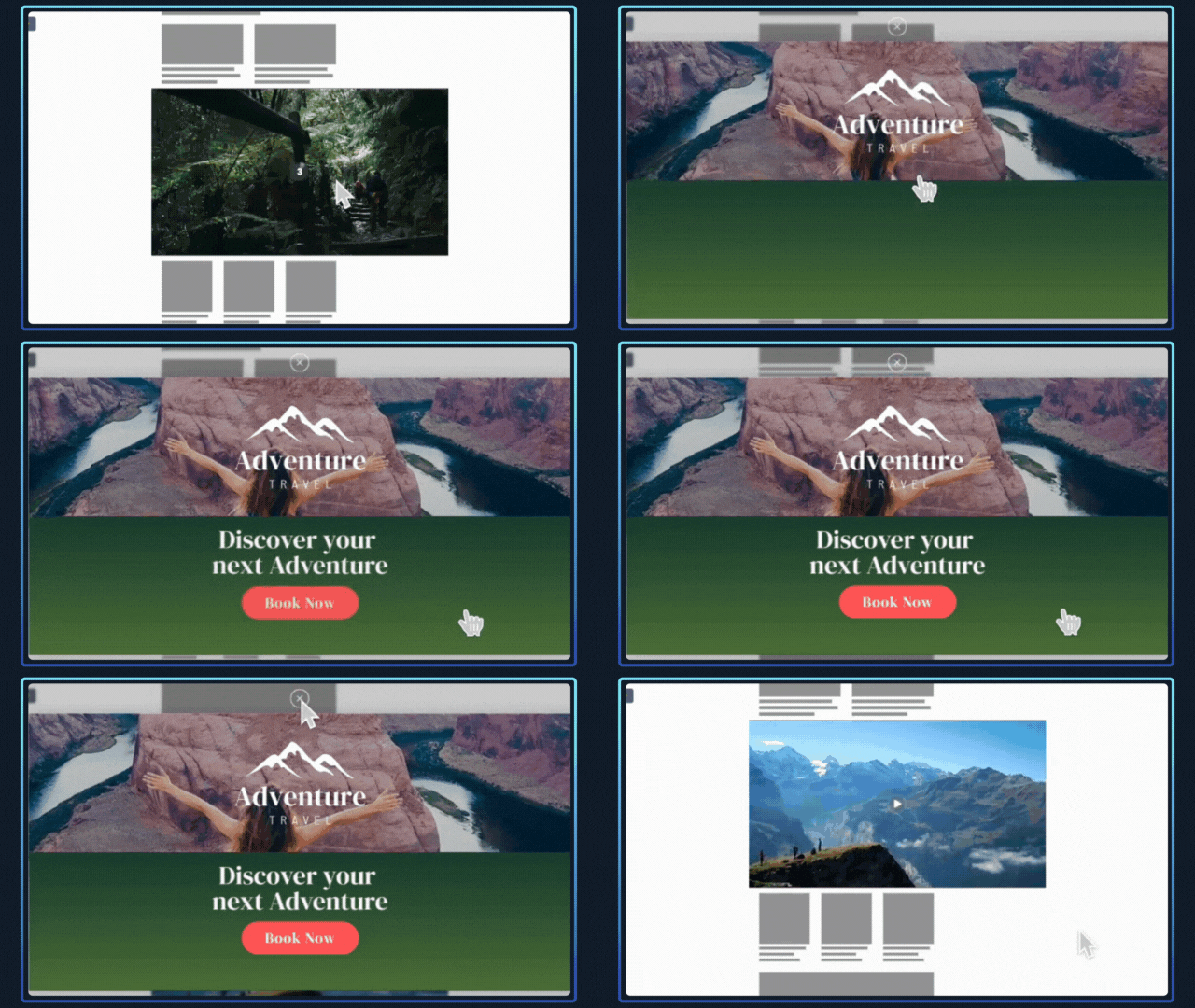
Inline Video Expand is an autoplaying video format that appears inline within the page content. You can choose to either upload your own MP4 file, or else use a VAST tag as the source of the video. An optional overlay can also be used to add static brand elements (such as a logo or CTA) on top of your video.
By interacting with the creative (hovering for 3 seconds or clicking), users can launch a full screen "expand", which can load additional rich content (such as a full-video trailer with audio, or a microsite).
Examples
Format Specs
Autoplay Content
Video
1280x720 (16:9) MP4 (Optimised for web)
OR VAST 4.0 Compatible Tag
Max duration 30 seconds. Audio buttons and other click-events are not available on autoplay content, as clicking anywhere on the banner will launch the expand.
Overlay (Optional)
1280x720 (16:9) PNG with transparent background
Endframe (Recommended)
1280x720 (16:9) JPG or PNG
Expand Content
Video (1920x1080 or 16:9), HTML5 Zipfile or embedded microsite.
Expand dimensions are roughly 90% of the window width, and 80% of the height. Expand content must be responsive, to ensure it can resize and adapt to fit different screen shapes and sizes.
If "expand mode" is set to "hover", the combined file weight of the autoplay + expand content must not exceed 3.5MB. If "expand mode" is set to "click", the limit is not as strict, and the creative may load up to an additional 20MB of expand content.
Format description and guidance
Inline Video is a high impact auto-playing video format that appears midway down the page (mid-content). The format accepts either an MP4 video, or a VAST tag as a source. An optional overlay can be used to add static brand elements on top of the video. It is strongly recommended to include a static endframe to safeguard against suspended auto-play. Read more about endframes here and ensure your ad never appears blank!
For the expand content, you may choose to use either an additional video, a custom HTML5 creative zip file, or embed your own website/microsite within an "external content" iFrame.
Click URL
Click URL should be added to your expanded content.
Max total file weight
Video: Files up to 50 MB are accepted, with a recommended maximum length of 20 seconds.
Image: Maximum 200kb.
Audio
User-initiated
Template Details
Video Streaming
General
| Parameter | Purpose |
|---|---|
| Click URL | Destination URL triggered when the user interacts with this element. Include https:// and any tracking parameters. |
| Video Asset | Provide the video asset video in MP4 or WEBM format, encoded for autoplay and kept under the maximum weight. |
Video Settings
| Parameter | Purpose | Default |
|---|---|---|
| Max Video Stream Weight | Sets the maximum allowed video stream weight used when selecting available encodes. | 3.5mb | choices: 3.5mb, 3.0mb, 2.5mb, 2.0mb, 1.5mb, 1.0mb |
| Scaling Mode | Sets the scaling behaviour of the video. Letterbox and Pillarbox add space. Cover may crop. Contain avoids cropping. Original Size keeps intrinsic dimensions. | Letterbox | choices: Letterbox, Pillarbox, Cover, Contain, Original Size |
| Video Position | Anchor Point used to position the video within the banner. | mid-center | choices: top-left, top-center, top-right, mid-left, mid-center, mid-right, bot-left, bot-center, bot-right |
| Audio | Enables or disables video audio. | Enabled | choices: Enabled, Disabled |
| Audio Button Position | Sets the position of the audio control button. | top-right | choices: top-left, top-right, bot-left, bot-right |
Background Settings
| Parameter | Purpose | Default |
|---|---|---|
| Background Type | Selects how the background behind the video is generated (auto extraction, custom image, colour fill or blurred video). | Auto Background | choices: Auto Background, Custom Image, Custom Colour, Blurred Video |
| Background Image | Image used when Background Type is set to Custom Image. | |
| Background Colour | Background fill used when Background Type is Custom Colour. | #FFFFFF |
Endframe (optional)
| Parameter | Purpose | Default |
|---|---|---|
| Endframe Image | Image displayed for the endframe when enabled. | |
| Endframe Settings | Selects when the endframe appears relative to the video (before, after, both or disabled). | Disabled | choices: After Video, Before Video, Before and After video, Disabled |
| Endframe Display Order | Sets layering order: show endframe above overlays or overlays above endframe. | Endframe on top of overlays | choices: Endframe on top of overlays, Overlays on top of endframe |
Overlay 1 (optional)
| Parameter | Purpose | Default |
|---|---|---|
| Asset | Image asset for overlay 1. | |
| Width | Width of the overlay. Use responsive units (vw, vh, %) or 'auto'. | auto |
| Height | Height of the overlay. Use responsive units (vw, vh, %) or 'auto'. | 10vh |
| Position | Position of the overlay relative to the banner. | top-center | choices: top-left, top-center, top-right, mid-left, mid-center, mid-right, bot-left, bot-center, bot-right |
| Time - In (optional) | Video time (seconds) at which the overlay appears. | |
| Time - Out (optional) | Video time (seconds) at which the overlay hides. |
Overlay 2 (optional)
| Parameter | Purpose | Default |
|---|---|---|
| Asset | Image asset for overlay 2. | |
| Width | Width of the overlay. Use responsive units (vw, vh, %) or 'auto'. | auto |
| Height | Height of the overlay. Use responsive units (vw, vh, %) or 'auto'. | 10vh |
| Position | Position of the overlay relative to the banner. | bot-center | choices: top-left, top-center, top-right, mid-left, mid-center, mid-right, bot-left, bot-center, bot-right |
| Time - In (optional) | Video time (seconds) at which the overlay appears. | |
| Time - Out (optional) | Video time (seconds) at which the overlay hides. |
Text Overlay (optional)
| Parameter | Purpose | Default |
|---|---|---|
| Text | Text content displayed as overlay. | |
| Font Size | Font size of the text overlay (supports responsive units). | 1vw |
| Position | Position of the overlay relative to the banner. | bot-center | choices: top-left, top-center, top-right, mid-left, mid-center, mid-right, bot-left, bot-center, bot-right |
| Text Colour | Colour of the text overlay. | #ffffff |
| Font | Font family used for the text overlay. | sans-serif | choices: sans-serif, serif, monospace, impact |
| Time - In (optional) | Video time (seconds) at which the overlay appears. | |
| Time - Out (optional) | Video time (seconds) at which the overlay hides. |
Overlay Config
| Parameter | Purpose | Default |
|---|---|---|
| Vertical Offset | Vertical distance from the top or bottom edges for overlays positioned top or bottom. | 12vh |
| Horizontal Offset | Horizontal distance from the left or right edges for overlays positioned left or right. | 6vh |