Inline Video is a high impact video format that appears in-line within the page content. You can choose to either upload your own MP4 file, or else use a VAST tag as the source of the video. An optional overlay can be used to add static brand elements on top of the video. Additionally an end-frame image is recommended to display a static message once the video has ended. Read more about endframes here and ensure your ad never appears blank!
Examples
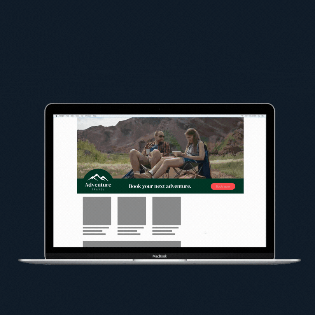
Desktop
Mobile
Format Specs
Video
1280x720 (16:9) MP4 (Optimised for web)
OR VAST 4.0 Compatible Tag
Max duration 30 seconds
Overlay (Optional)
1280x720 (16:9) PNG with transparent background
Endframe (Recommended)
1280x720 (16:9) JPG or PNG
Format description and guidance
Inline Video is a high impact auto-playing video format that appears midway down the page (mid-content). The format accepts either an MP4 video, or a VAST tag as a source. Optional overlays and end-frame images can also be uploaded, to further customise the appearance of the format. it is strongly recommended to include a static endframe to safeguard against suspended auto-play. Read more about endframes here and ensure your ad never appears blank!
Click URL
Click tracking is included in the template. If the VAST tag contains a clickthrough URL, it will automatically be used.
Max total file weight
Video: Files up to 50 MB are accepted, with a recommended maximum length of 20 seconds.
Image: Maximum 200kb.
Audio
User-initiated
Template Details
Video Streaming
General
| Parameter | Purpose |
|---|
| Click URL | Destination URL triggered when the user interacts with this element. Include https:// and any tracking parameters. |
| Video Asset | Provide the video asset video in MP4 or WEBM format, encoded for autoplay and kept under the maximum weight. |
Video Settings
| Parameter | Purpose | Default |
|---|
| Max Video Stream Weight | Sets the maximum allowed video stream weight used when selecting available encodes. | 3.5mb | choices: 3.5mb, 3.0mb, 2.5mb, 2.0mb, 1.5mb, 1.0mb |
| Scaling Mode | Sets the scaling behaviour of the video. Letterbox and Pillarbox add space. Cover may crop. Contain avoids cropping. Original Size keeps intrinsic dimensions. | Letterbox | choices: Letterbox, Pillarbox, Cover, Contain, Original Size |
| Video Position | Anchor Point used to position the video within the banner. | mid-center | choices: top-left, top-center, top-right, mid-left, mid-center, mid-right, bot-left, bot-center, bot-right |
| Audio | Enables or disables video audio. | Enabled | choices: Enabled, Disabled |
| Audio Button Position | Sets the position of the audio control button. | top-right | choices: top-left, top-right, bot-left, bot-right |
Background Settings
| Parameter | Purpose | Default |
|---|
| Background Type | Selects how the background behind the video is generated (auto extraction, custom image, colour fill or blurred video). | Auto Background | choices: Auto Background, Custom Image, Custom Colour, Blurred Video |
| Background Image | Image used when Background Type is set to Custom Image. | |
| Background Colour | Colour used when Background Type is set to Custom Colour or to fill letterboxed areas. | #FFFFFF |
Endframe (optional)
| Parameter | Purpose | Default |
|---|
| Endframe Image | Image displayed for the endframe when enabled. | |
| Endframe Settings | Selects when the endframe appears relative to the video (before, after, both or disabled). | Disabled | choices: After Video, Before Video, Before and After video, Disabled |
| Endframe Display Order | Sets layering order: show endframe above overlays or overlays above endframe. | Endframe on top of overlays | choices: Endframe on top of overlays, Overlays on top of endframe |
Overlay 1 (optional)
| Parameter | Purpose | Default |
|---|
| Asset | Image asset for overlay 1. | |
| Width | Width of the overlay. Use responsive units (vw, vh, %) or 'auto'. | auto |
| Height | Height of the overlay. Use responsive units (vw, vh, %) or 'auto'. | 10vh |
| Position | Position of the overlay relative to the banner. | top-center | choices: top-left, top-center, top-right, mid-left, mid-center, mid-right, bot-left, bot-center, bot-right |
| Time - In (optional) | Video time (seconds) at which the overlay appears. | |
| Time - Out (optional) | Video time (seconds) at which the overlay hides. | |
Overlay 2 (optional)
| Parameter | Purpose | Default |
|---|
| Asset | Image asset for overlay 2. | |
| Width | Width of the overlay. Use responsive units (vw, vh, %) or 'auto'. | auto |
| Height | Height of the overlay. Use responsive units (vw, vh, %) or 'auto'. | 10vh |
| Position | Position of the overlay relative to the banner. | bot-center | choices: top-left, top-center, top-right, mid-left, mid-center, mid-right, bot-left, bot-center, bot-right |
| Time - In (optional) | Video time (seconds) at which the overlay appears. | |
| Time - Out (optional) | Video time (seconds) at which the overlay hides. | |
Text Overlay (optional)
| Parameter | Purpose | Default |
|---|
| Text | Text content displayed as overlay. | |
| Font Size | Font size of the text overlay (supports responsive units). | 1vw |
| Position | Position of the overlay relative to the banner. | bot-center | choices: top-left, top-center, top-right, mid-left, mid-center, mid-right, bot-left, bot-center, bot-right |
| Text Colour | Colour of the text overlay. | #ffffff |
| Font | Font family used for the text overlay. | sans-serif | choices: sans-serif, serif, monospace, impact |
| Time - In (optional) | Video time (seconds) at which the overlay appears. | |
| Time - Out (optional) | Video time (seconds) at which the overlay hides. | |
Overlay Config
| Parameter | Purpose | Default |
|---|
| Vertical Offset | Vertical distance from the top or bottom edges for overlays positioned top or bottom. | 12vh |
| Horizontal Offset | Horizontal distance from the left or right edges for overlays positioned left or right. | 6vh |
VAST Tag Player
General
| Parameter | Purpose |
|---|
| Click URL | Global click destination for the player. |
| VAST Tag URL | Third-party VAST tag used for playback. |
Video Config
| Parameter | Purpose | Default |
|---|
| Scaling Mode | Sets how the video scales. Cover fills and may crop. Contain avoids cropping but may leave space. | contain | choices: contain, cover |
| Audio | Enables or disables video audio. | Enabled | choices: Enabled, Disabled |
| Background Colour | Colour behind the video when space remains after scaling. | #000000 |
Endframe & Overlay
| Parameter | Purpose | Default |
|---|
| Endframe Settings | Controls when the endframe appears relative to playback. | Disabled | choices: After Video, Before Video, Before and After video, Disabled |
| Endframe Image | Image displayed as endframe when enabled. | |
| Overlay Image (optional) | Optional overlay displayed above the video. | |