At Adnami, we’re committed to improving attention outputs through a deep understanding of attention data and making insights actionable. In this blog, we’ll share an example of a method for optimising campaigns based on attention. This approach is especially useful for advanced and larger campaigns with multiple formats and domains.
When analysing data from a large campaign it’s crucial to understand where optimisation efforts will have the most impact. One effective approach is to create domain cohorts based on attention - a key metric that serves as a proxy for campaign effectiveness - per format and analyse where the majority of impressions are allocated. This analysis can be done in three simple steps.
Step 1: calculate and categorise your attention
For each format in your campaign, calculate the average attention generated split by domains. This is as simple as a few clicks within the Adnami platform where you can use Sonar, our attention measurement tool, to track attention metrics and more. Once you've calculated average attention outcomes, divide the domains into four cohorts based on performance.
- Cohort 1: The top 25% of domains with the best attention performance.
- Cohort 2: The next 25% of domains with strong, but not top-tier, attention performance.
- Cohort 3: The 25% of domains with below-average attention performance, but not the worst.
- Cohort 4: The bottom 25% of domains with the worst attention performance.
Step 2: visualise attention and impressions
Summarise the number of impressions delivered in each cohort and create a chart like the examples outlined in Step 3. The bars should show the average attention (eAPM) for each cohort, while the line overlays the number of impressions.
Step 3: analyse the data
Here’s where the magic happens. By analysing the relationship between the bar and the line charts, one of the three distinct figures can emerge:
1. The slide
The line chart steadily decreases from left to right creating a “slide” that follows the cohorts. This shows that the majority of impressions are delivered to the best-performing domains and signifies a well-optimised format. Some impressions are still delivered to lesser-performing domains which is not uncommon. Attention cannot stand alone - reach is still important, meaning delivery to some “bad” domains may still make sense.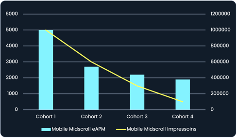
2. The hill
The line chart forms a “hill” indicating most impressions are bought on mediocre performing domains. While not terrible, there's room for improvement. Allocating more impressions to the best-performing domains could boost attention metrics and campaign performance.

3. The ramp
The line chart sharply declines in the opposite direction of the bar chart forming a “ramp”. This is a typical representation of a poorly optimised campaign with the majority of impressions being bought on poor-performing domains. It is also the first place to start optimising.

Putting it all together
Understanding whether your data forms a slide, a hill or a ramp allows you to visually pinpoint areas with the greatest potential for improvement. By reallocating impressions to better-performing domains, you can improve the overall attention output of your campaigns and drive better results. This method is an effective way to make attention data actionable, ensuring campaigns are not only efficient but also impactful.
.png?width=352&name=attention%20webinar%20(1).png)
.png?width=352&name=blog_thumbnails_288x200%20(1).png)